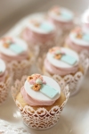
Front

Inside

Back
 Video Showcase
- Description: A tri folding brochure.
- Process (Programs, Tools, Skills):
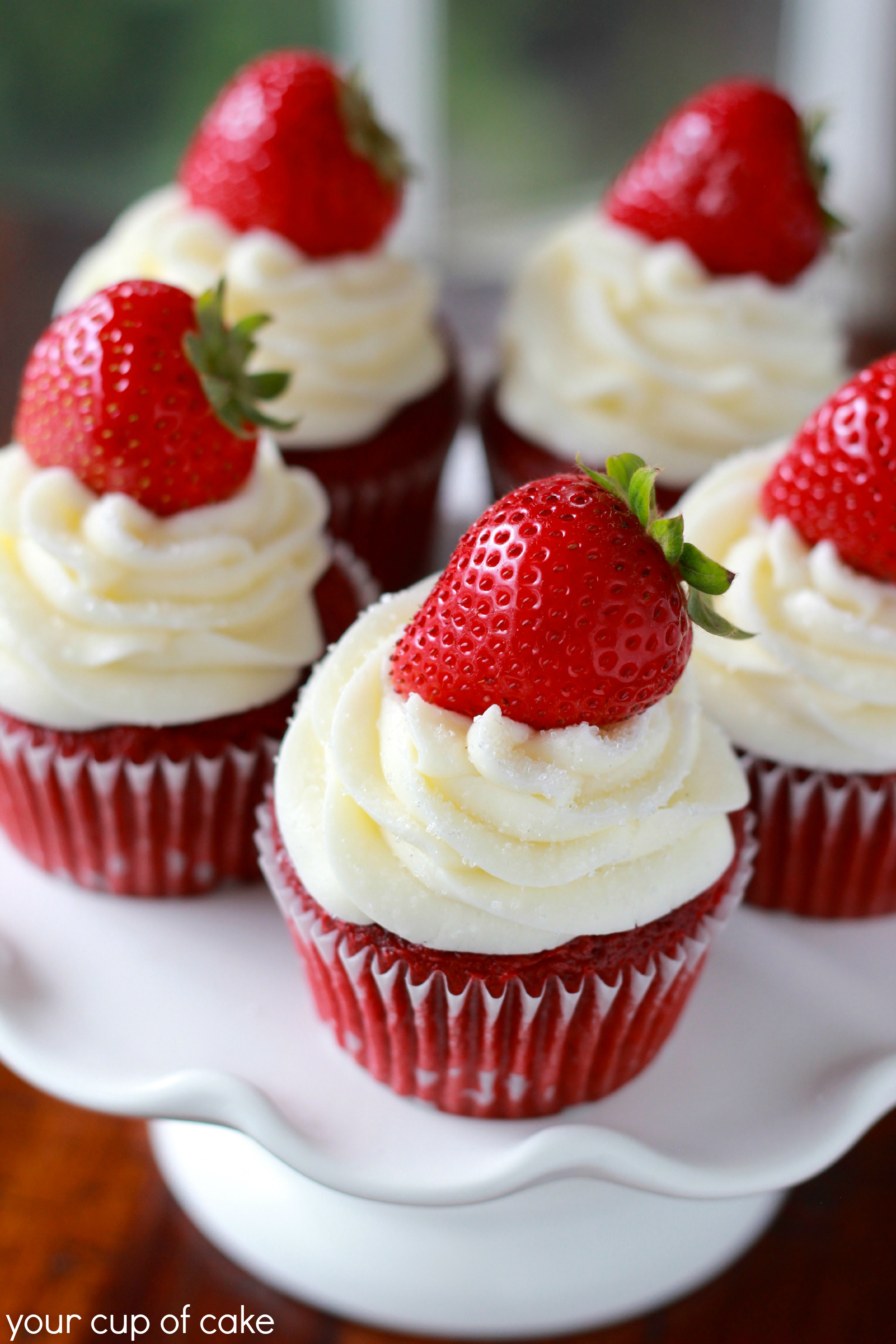
The first step of my process after drafting out my brochure was to open InDesign. I created two pages and put in guides for the folding marks. I then labeled each panel to make sure I knew which panel went where.Next I made the logo. I went online and looked up a picture of a cupcake. I used the pen tool in Adobe Illustrator to outline the shape and curves of the cupcake. The outline of my cupcake became my logo with the words Cupcake Cafe underneath. I did a text wrap around the image of the strawberry cupcake. Before I was able to do text wrapping I had to edit the image in Photoshop. I carefully traced around the single cupcake and made a mask. With the transparent mask I was able to place that image in my brochure and wrap text around it.The image on the back had ribbons with words that went across. This gave me the idea to put my headings on ribbons. This created repetition through the whole piece, and unified it as a whole. I alternated the color of ribbon and the text depending on each individual panel. To add more design elements to the brochure I did a chevron design on three of the panels. - Message: This is an information brochure about the Cupcake Cafe. Included is the story of how the Cupcake Cafe began, prices, flavors, and catering information.
- Audience: Any cupcake loving individual looking for a tasty treat.
- Top Thing Learned: How to create a brochure both informational, and appealing to the eye.
- Color scheme and color names: Complementary color scheme. (red (pink), yellow, blue)
- Title Font Name & Category: Memphis -Slab Serif-
- Copy Font Name & Category: Gill Sans -Sans Serif-
- Word Count of copy: 325
- Thumbnails of Images used:

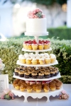
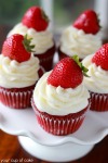
- Sources (Links to images on original websites)
http://www.longdistanceloving.net/2013/09/why-you-should-always-eat-cupcake.html
http://www.playpartypin.com/2014/05/blushing-bride-bridal-shower.html
http://crave-catering.com/vendor-spotlight-polka-dots-cupcake-factory/
http://www.yourcupofcake.com/2013/08/strawberry-red-velvet-cupakes.html


Kellie! I love your brochure! I love sweets too and also did my brochure on food. Great job on finding a photo to match your color scheme! I love the chevron background on some of your pages. Great job! I really liked how you displayed your titles in the banner-type-flag, super cute. You should be super proud of this because it’s great!
I would love for your feedback on my brochure project. Feel free to check it out:
https://afisherinthesea.wordpress.com/2015/03/28/project-8-brochure/
LikeLike
Your brochure looks really professional. I like the colors you used. They look so inviting and it makes me wish that I could have a cupcake. The pictures you used are absolutely fantastic for your subject. I think you’ll also like Sarah’s brochure: https://sarahembrycomm130.wordpress.com/2015/03/27/p8-brochure/comment-page-1/#comment-12
LikeLike
I had to leave a comment on this one. I love food and this has such a captivating color pattern and repetition that is distinct enough to tie it in yet separate enough to make you wonder what’s up. This is a very professional layout and I like the flatten logo styled design. You will go far if you keep this kind of creativity up. Great work!
Check out this Linkback:
https://runlittlejo.wordpress.com/2015/03/27/project-8-brochure/
LikeLike